Academic Access, Simplified
Improving onboarding and enrollment for academic users
ROLE
UX/UI Designer
TIMELINE
6 months, alongside other product priorities
TEAM
Product Manager
4 Engineers (FE + BE) QA Engineer
SKILLS
Systems Thinking
Interaction Design
Cross-Functional Collaboration
OVERVIEW
Before migrating academic users to our 2.0 platform, we needed to build a new academic enrollment flow.
The legacy “student store” relied on a long dropdown of schools, offered limited functionality, and caused frequent errors. Students often purchased the wrong type of membership, leading to refunds and frustration.
SOLUTION
A simpler, smarter enrollment flow that reduces errors and enables migration.
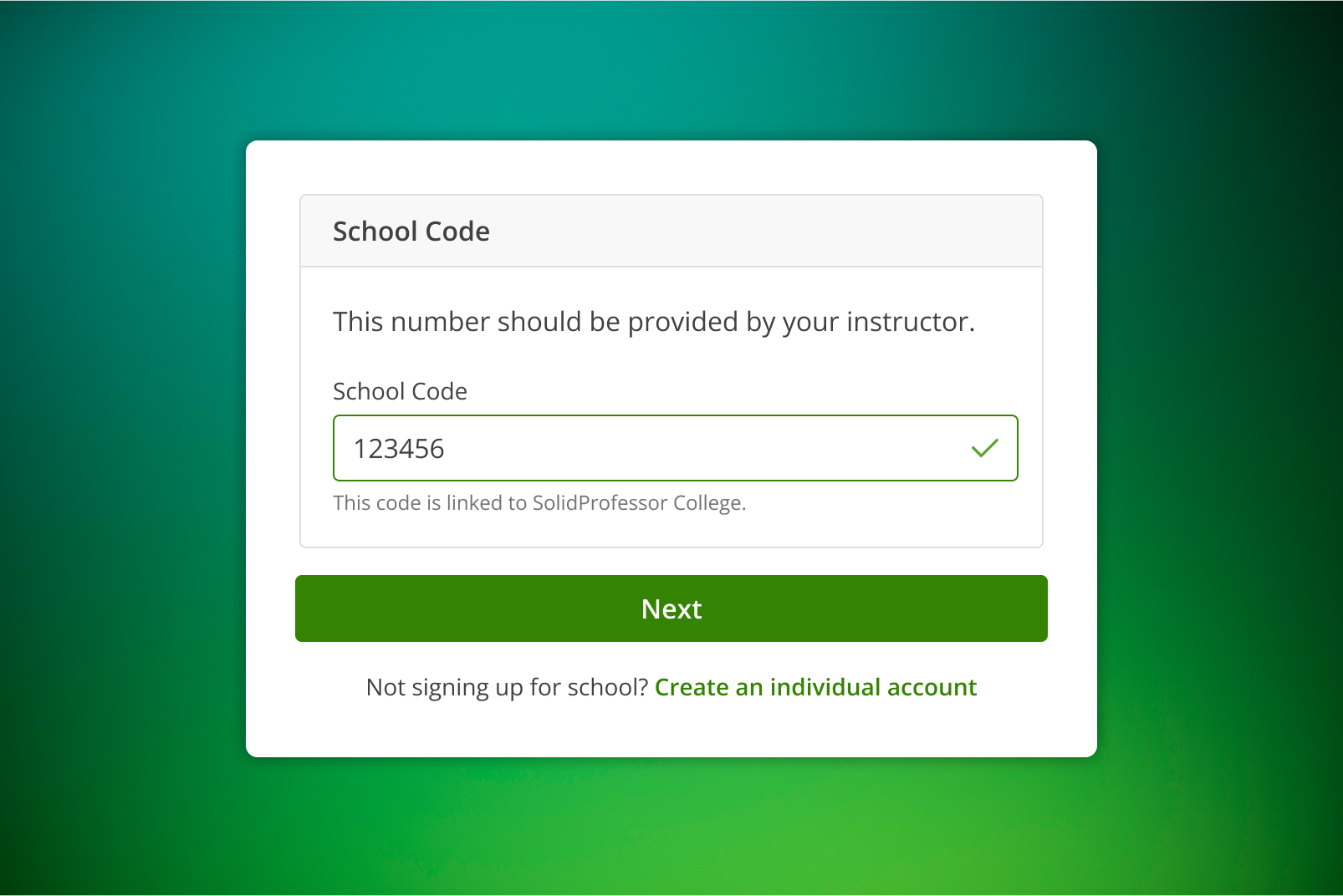
Introduced a streamlined flow that simplified school selection by replacing the error-prone dropdown with a school code entry field. Improved overall usability with clearer guidance, modernized UI patterns, and logic that adapted to different user types. The result was a more efficient, scalable process that reduced enrollment errors and supported a smooth migration to the 2.0 platform.


Real-time validation provides immediate feedback on school code entry
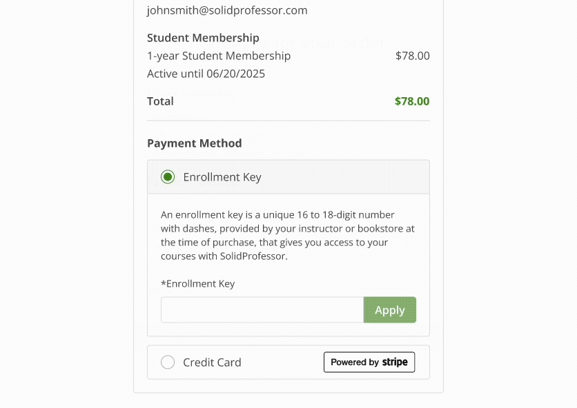
Key applied; button unlocks for a smooth checkout
Confirmation page reinforces completion and offers a clear path back to the dashboard
INITIAL FINDINGS
Audited the legacy “student store” to identify usability issues and visual design inconsistencies.
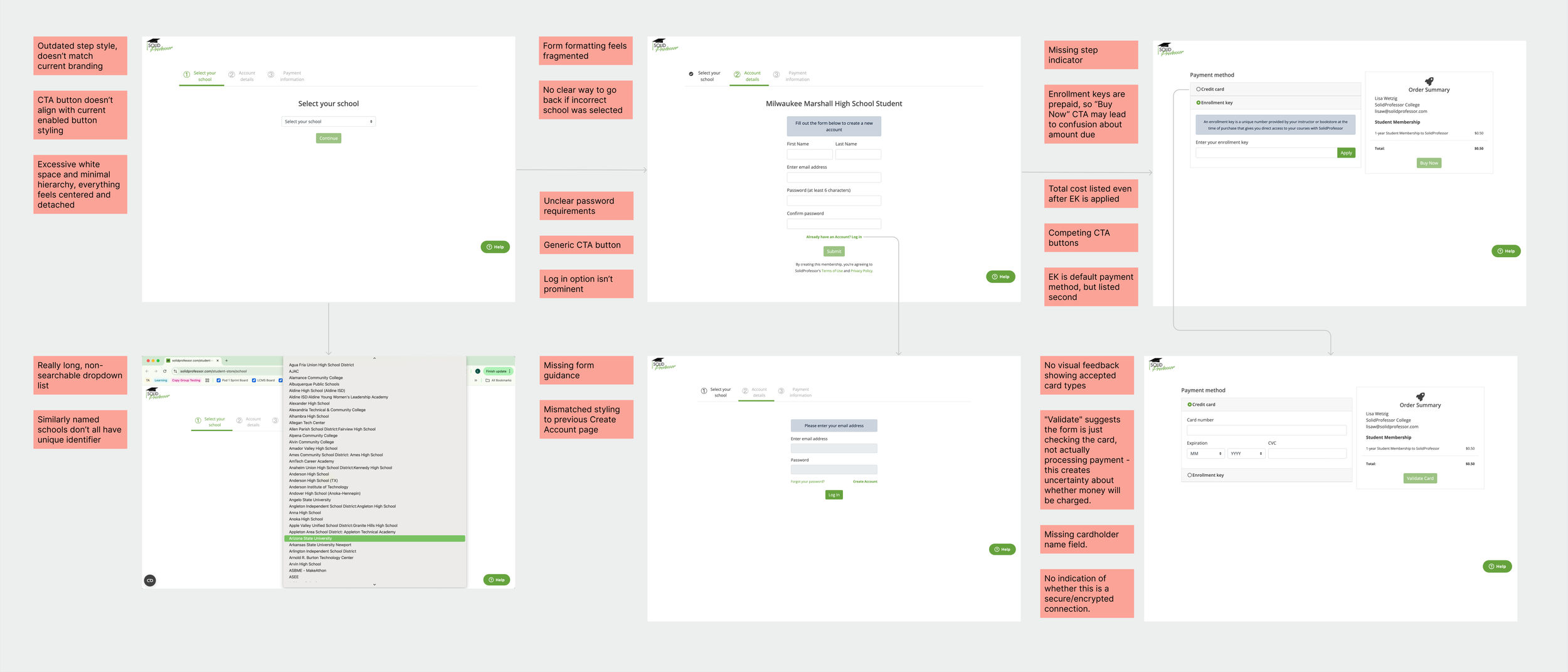
After auditing the legacy “student store” and reviewing the enrollment process with the PM and CS team, we aligned on the key usability and operational issues impacting students and support teams.
TOP PAIN POINTS
Fragmented sign-up flows
Multiple entry points made it difficult
for students to find the correct
starting point.
Challenging navigation
Long school dropdown is hard to scan and use.
Lack of clarity
Schools with similar names had no differentiation, making it difficult for students to know if they were joining the correct one.
The student store lacked clarity and structure, causing students to start in the wrong place, purchase incorrect memberships, and created additional workload for support teams handling refunds and setup issues.
Operational overhead
CS had to process manual refunds for mispurchases, adding cost and delay.
PROBLEM STATEMENT
Incorrect purchases
Students often bought the wrong membership type during enrollment.
DESIGN PROCESS
Guided by the hypothesis that clearer guidance would reduce enrollment errors and support tickets, I redesigned the student enrollment experience to simplify navigation, reduce mispurchases, and modernize the interface.
Exploration
Created multiple mockups and prototypes exploring different ways to structure enrollment, informed by engineering constraints and UX principles to reduce cognitive load.
Mapped the logic for new vs. existing students to clarify entry points and dependencies, ensuring validation and account creation happened in the correct order.
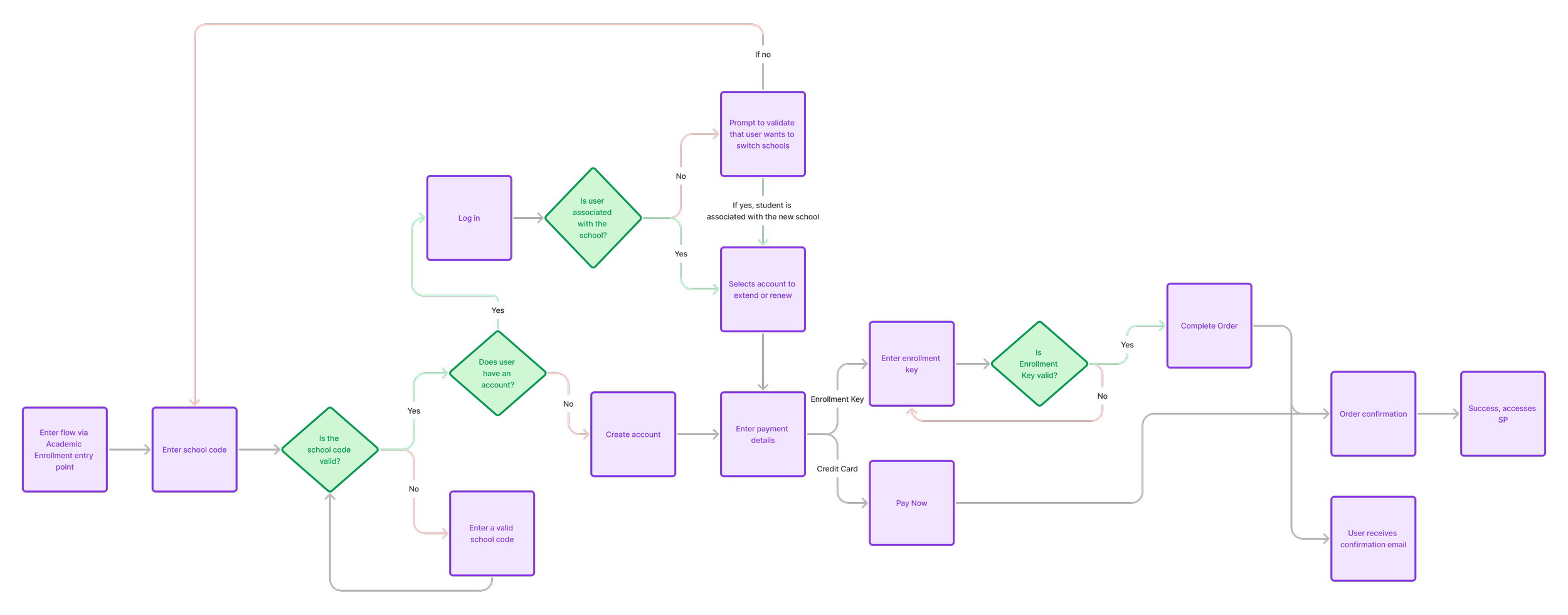
User flow logic: New vs. existing students
Broke the flow into clear, sequential steps (school code → account info → payment → confirmation) for easier comprehension and validation. The final design ensured alignment with UX goals and engineering feasibility.
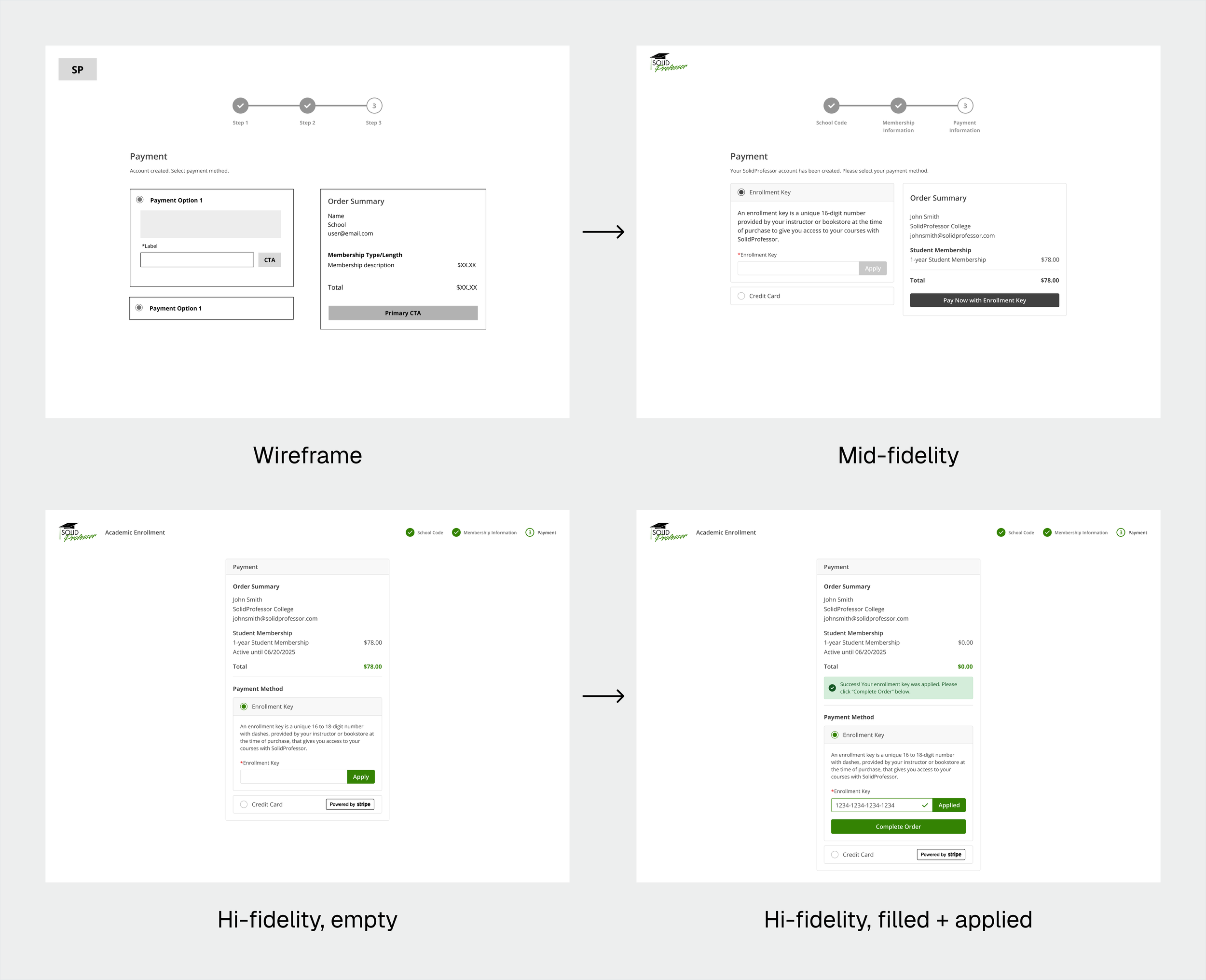
Payment page evolution
Collaboration + Iteration
Partnered with the PM to define MVP priorities and align on business requirements.
Worked with engineers to refine validation logic for accurate school code matching and secure payments.
Integrated Customer Success feedback for inline help, clearer enrollment key messaging, and direct support access.
Validated flow clarity and messaging through internal prototype reviews.
Applied accessibility best practices: clear step indicators, inline errors, and strong color contrast.
Ensured responsive design and modern UI patterns across devices.
Added usability enhancements like membership visibility and school-switching within the flow.
DESIGN EXPLORATION
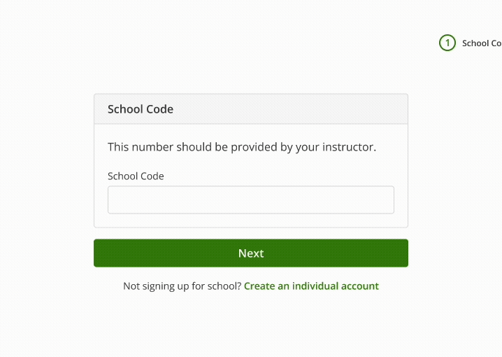
School Code Entry & Validation
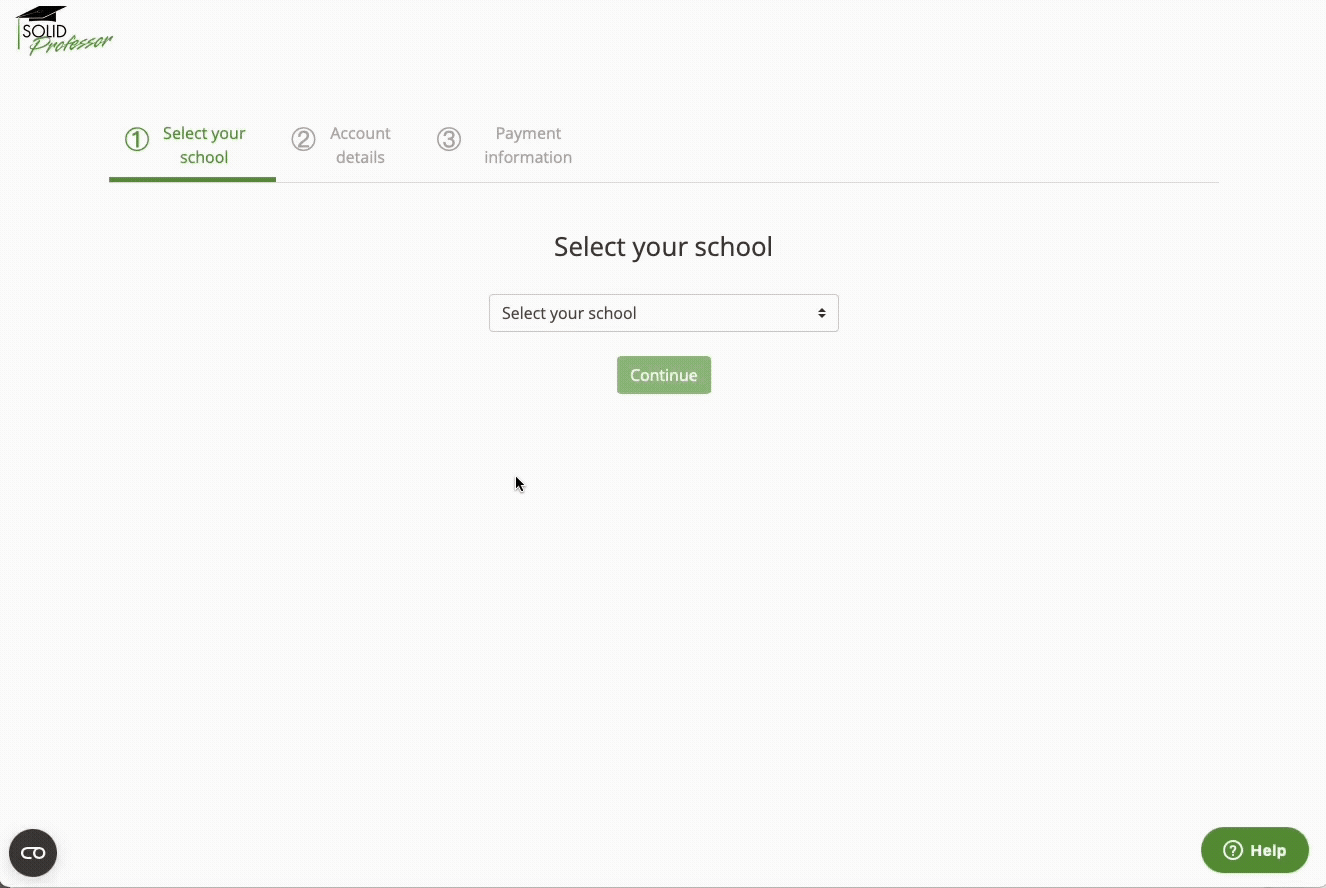
Before
Context + Rationale
Replaced the legacy dropdown, which was long, hard to scan, and caused mispurchases.
Explored inline validation vs. post-submit errors and added messaging to clearly show which school the student was selecting.
Incorporated detailed error messaging for schools not enabled for Academic Enrollment, based on Customer Success feedback from design reviews, to prevent student confusion and reduce support requests.
Result: A faster, more reliable entry point that reduces errors and frustration.
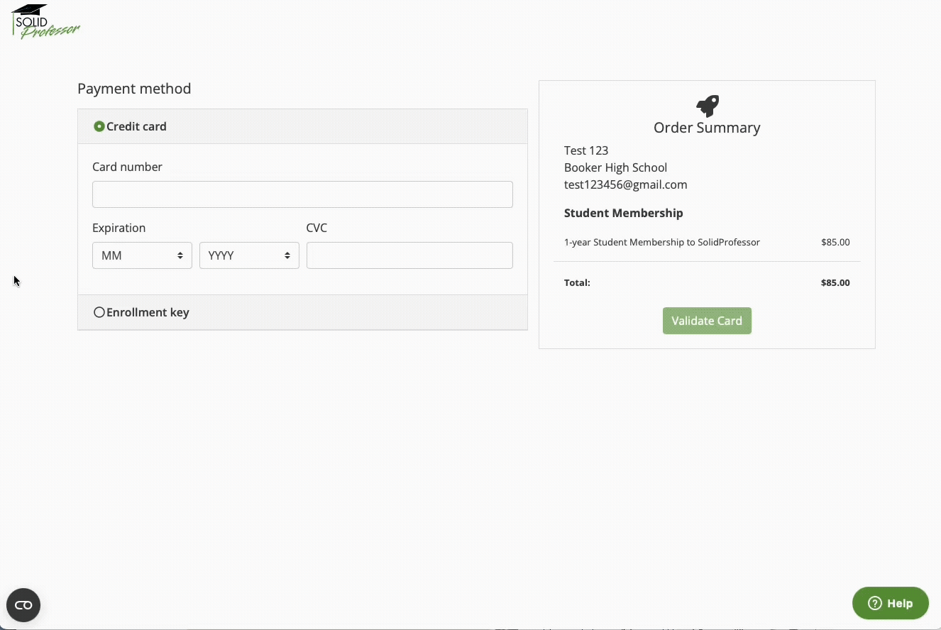
Payment & Enrollment Key Flow
Before
After
After
Context + Rationale
Enhanced clarity around the enrollment key process, ensuring students could only proceed once a valid key was applied. This was a key improvement from the legacy flow, where students could click “Apply” with an empty field and only see the generic error, “The enrollment_key field is required.”
Explored various messaging approaches and button states: disabling vs. hiding, inline confirmation placement.
Incorporated engineering constraints and feedback to help prevent invalid transactions and ensure Stripe compatibility.
Result: Established a clearer, guided process that’s expected to minimize invalid submissions and streamline enrollment.
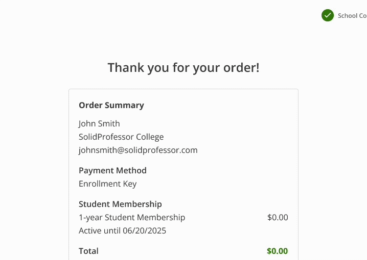
Confirmation & Dashboard Access

Before
After
Context + Rationale
Added a clear confirmation step, receipt download option, and direct link back to the user dashboard.
Explored layout and call-to-action placement, ensuring students could easily confirm their enrollment, print receipts, and return to the platform.
Result: Gave students more confidence and clarity at the end of enrollment, reducing potential post-purchase confusion once live.
CHALLENGES + CONSTRAINTS
Edge Cases
Designing for students switching schools mid-enrollment added unexpected complexity. It was a rare use case that consumed time likely better spent refining the core flow.
Migration Complexity
Running legacy and 2.0 systems in parallel required a temporary redirect page to guide users to the correct flow. This short-term solution ensured continuity and minimized confusion during rollout.
Limited Data
With little behavioral data from the legacy system, early decisions relied on Customer Success feedback and post-launch monitoring to validate assumptions.
OUTCOMES + IMPACT
Impact
Achieved feature parity required for migration.
Reduced potential for mispurchases through clearer enrollment types and stronger validation logic.
Established a scalable framework adaptable for renewals, extensions, and future enrollment features.
What I’d Do Differently
Advocate earlier for deprioritizing low-value edge cases like the school change flow.
Push for baseline data collection before building to inform priorities with evidence.
Potential Metrics (feature launching early 2026)
↓ Enrollment-related support tickets
↓ Refunds from incorrect purchases
↑ Customer Success efficiency and satisfaction
↑ User clarity and completion confidence
*Post-launch metric impacts set up to capture data:
Volume of tickets tagged “enrollment” or “sign-up issue” in the CS support system before and after launch
Refund data from Stripe to compare to legacy enrollment flow
CS team pulse survey to measure perceived improvement in process clarity and workload reduction
Added a post-enrollment survey to capture students’ confidence and experience in 2.0 flow
FINAL SOLUTION
Delivered a streamlined, modernized enrollment flow with step-by-step guidance and reusable components, creating a scalable, user-friendly experience for students.

Final 2.0 enrollment flow for existing users, designed for clarity, scalability, and ease of use.
REFLECTION
What I learned
Designing through constraints
Simplifying complex logic within migration and technical limits taught me how to balance clarity, feasibility, and user trust.
Product thinking + prioritization
Gained confidence in advocating for simplifying scope to deliver value faster, rather than over-designing for rare scenarios.